3 Essential Free Visuals to Improve Your Power B Reports
Enhancing Power BI’s capabilities by installing custom Microsoft visuals.

Microsoft’s Power BI arrives to users equipped with 40+ visualization tools, ranging from matrixes and bar charts to more advanced tools like decomposition trees and filled maps. Newcomers to the software, though, may be unaware that users can also add more tools in addition to the pre-set ones that Microsoft provides. In today’s blog post, we will review three free and downloadable visuals any report builder can add to their data visualization bank.
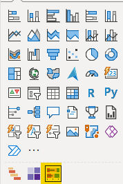
To download a new visual, I will open Power BI, select the “…” icon below, and click “Get more visuals.”
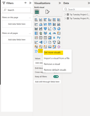
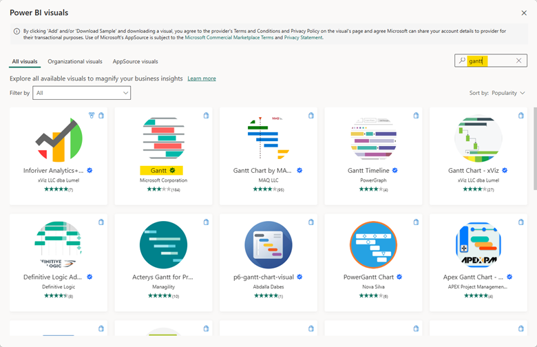
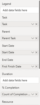
When I select that button, hundreds of custom data visuals created by firms like Microsoft, ZoomCharts and Zebra BI become available to me. Today, though, I will only concentrate on three tools from Microsoft directly: the Gantt chart, table heatmap, and bullet chart.
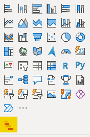
After selecting the visual above, I can add it to my bank below the standard visuals I have already been provided.
Gantt Chart
Gantt charts are powerful tools for providing visual coverage of a project’s health and progress. They can, though, be tricky to build. By utilizing the project plan and checklist I built in Smart Sheet for the previous blog post, I assembled this Gantt chart.
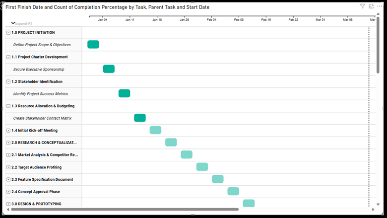
I built this chart so that completed tasks would be bold green and incomplete tasks would be a lighter green, signaling to myself and any possible consumers of the report that those tasks are still ongoing. On the righthand side of the chart, you will even find a vertical dotted line indicating the day of the month in relation to your project tasks. The difficult part when creating the Gantt chart is properly assigning the data from your tables to the visual itself. Below, I have provided a screenshot of how I structured this chart.
QUICK TIP: The margins for the data labels on the lefthand side of the chart tend to arrive tight and difficult to read. To fix this, select the Category Labels button and adjust your Width to fit the needs of your report labels.
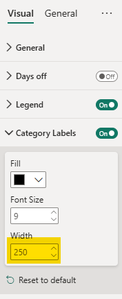
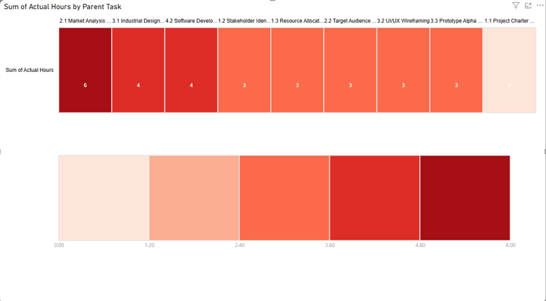
Table Heatmap
To utilize a table heatmap, we will follow the same process as before to select Microsoft’s version. The logo should match the image below:
Table heatmaps help viewers understand the distribution of hours across tasks and identify which tasks have required more hours of work than others. By pulling the tasks and actual hours from my project plan, I created the heatmap below to identify the highest concentration of hours worked per task. With just two easy data points, this visual provides me with the tools to combat excess WIP in my projects.
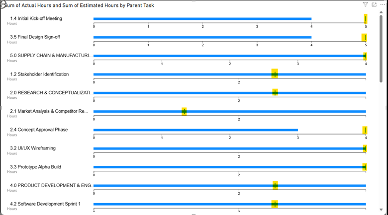
Bullet Chart
Finally, we have bullet charts. These charts are similar to heatmaps but provide additional context for the estimated hours of a task in a project. Again, we are using a Microsoft product like the one below.
The following bullet chart examines the project tasks based on the actual hours and the estimated hours associated with the individual task. Instances where the project task has a dash in the middle its bar indicates actual hours have exceeded estimated hours. Vice versa, any lines that are short of the vertical line show they came under the estimated number of hours.
Power BI is a powerful data visualization tool for any firm, large or small, to utilize for their own internal analysis. Why limit the product’s capabilities by only using provided visualizations? Instead, users should play around with additional products like we did in these examples. If you have any questions about Power BI and custom visualizations, or are interested in adding this solution to your company's report management repertoire, please visit our website - ConstrucTech Consulting - and Book a Call with one of our consultants.
Microsoft’s Power BI arrives to users equipped with 40+ visualization tools, ranging from matrixes and bar charts to more advanced tools like decomposition trees and filled maps. Newcomers to the software, though, may be unaware that users can also add more tools in addition to the pre-set ones that Microsoft provides. In today’s blog post, we will review three free and downloadable visuals any report builder can add to their data visualization bank.
To download a new visual, I will open Power BI, select the “…” icon below, and click “Get more visuals.”
When I select that button, hundreds of custom data visuals created by firms like Microsoft, ZoomCharts and Zebra BI become available to me. Today, though, I will only concentrate on three tools from Microsoft directly: the Gantt chart, table heatmap, and bullet chart.
After selecting the visual above, I can add it to my bank below the standard visuals I have already been provided.
Gantt Chart
Gantt charts are powerful tools for providing visual coverage of a project’s health and progress. They can, though, be tricky to build. By utilizing the project plan and checklist I built in Smart Sheet for the previous blog post, I assembled this Gantt chart.
I built this chart so that completed tasks would be bold green and incomplete tasks would be a lighter green, signaling to myself and any possible consumers of the report that those tasks are still ongoing. On the righthand side of the chart, you will even find a vertical dotted line indicating the day of the month in relation to your project tasks. The difficult part when creating the Gantt chart is properly assigning the data from your tables to the visual itself. Below, I have provided a screenshot of how I structured this chart.
QUICK TIP: The margins for the data labels on the lefthand side of the chart tend to arrive tight and difficult to read. To fix this, select the Category Labels button and adjust your Width to fit the needs of your report labels.
Table Heatmap
To utilize a table heatmap, we will follow the same process as before to select Microsoft’s version. The logo should match the image below:
Table heatmaps help viewers understand the distribution of hours across tasks and identify which tasks have required more hours of work than others. By pulling the tasks and actual hours from my project plan, I created the heatmap below to identify the highest concentration of hours worked per task. With just two easy data points, this visual provides me with the tools to combat excess WIP in my projects.
Bullet Chart
Finally, we have bullet charts. These charts are similar to heatmaps but provide additional context for the estimated hours of a task in a project. Again, we are using a Microsoft product like the one below.
The following bullet chart examines the project tasks based on the actual hours and the estimated hours associated with the individual task. Instances where the project task has a dash in the middle its bar indicates actual hours have exceeded estimated hours. Vice versa, any lines that are short of the vertical line show they came under the estimated number of hours.
Power BI is a powerful data visualization tool for any firm, large or small, to utilize for their own internal analysis. Why limit the product’s capabilities by only using provided visualizations? Instead, users should play around with additional products like we did in these examples. If you have any questions about Power BI and custom visualizations, or are interested in adding this solution to your company's report management repertoire, please visit our website - ConstrucTech Consulting - and Book a Call with one of our consultants.


Get Started
Take your construction company to the next level. Schedule your initial free consultation and analysis.